Crack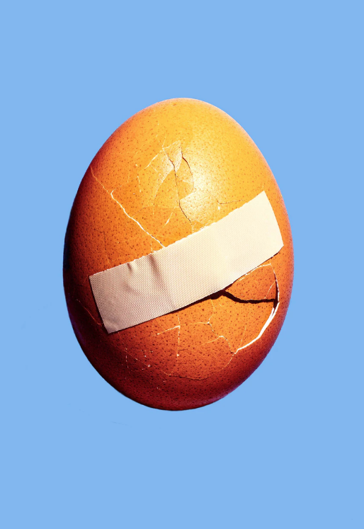
Untitled 2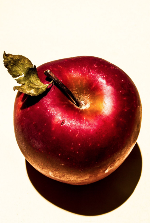
Untitled 3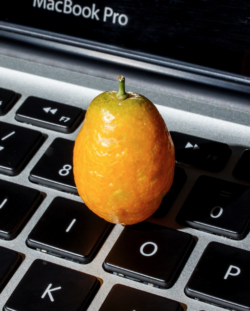
|
egg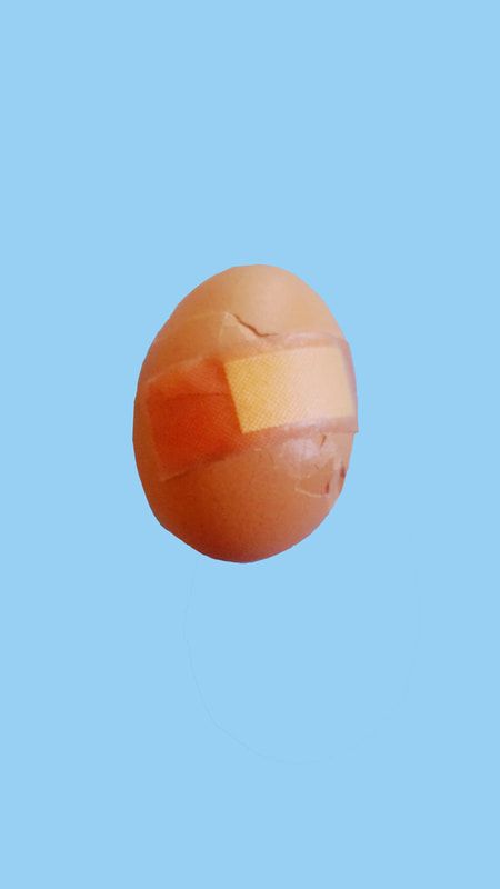
Apple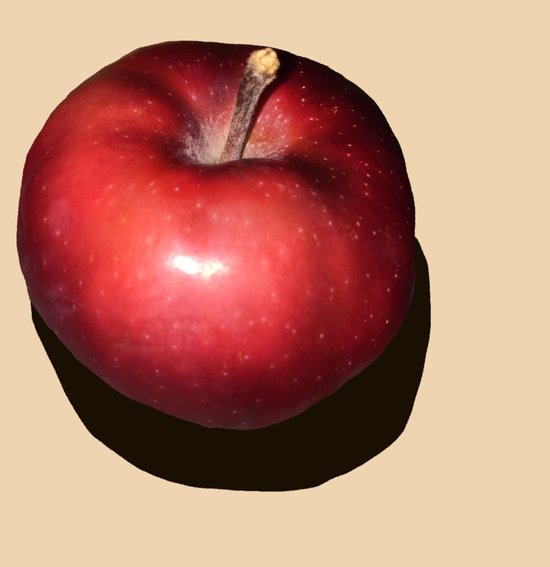
Orange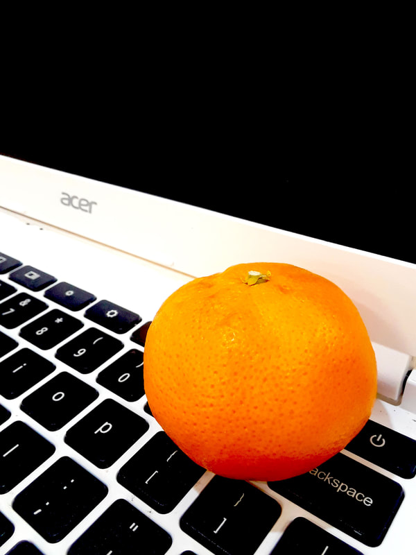
|
Name of Artist: Maurizio di Iorio
Dates of Artist’s Life: Born: June 6, 1959
1. Personal Background
Maurizio di Iorio was born sometime in the 1900s, we don’t know the exact date as that was not available on the internet. He was born in Italy, and didn’t originally study to become an artist.
Di Iorio went to law school. He bought his first camera in 2009 and became a photographer in 2011 when he decided he wanted to change his career. He taught himself, but you wouldn’t know that from his pictures.
2. Style
Di Iorio uses bright contrasting colors that make the subjects pop. His pictures also use a lot of repetition and (a)symmetrical balance He also uses strange objects that provoke thought even where they aren’t supposed to. His pictures are a lot like the paintings of Andy Warhol. Both use pop art of commercial items and are slightly jarring to look at.
3. Philosophy
He isn’t trying to say anything. According to the artist’s website, he doesn’t like photography that sends a message. He says that there is no meaning that a giant toothbrush can convey. It’s meant to look cool and aesthetically pleasing, not make you delve into an existential crisis. His photographs speak of the relation between people and things in a day-to-day setting.
4. Influences
The photographer has influenced my work by using a lot of colors. I had to try really hard to get such extreme colors and it didn’t usually work. To get such extreme saturation, I had to use a lot of photoshop. I find that using bright colors makes it a lot harder to take pictures than when you just use black and white. However, Di Iorio stated that he tries to do the exact opposite with his extremely saturated colorful pictures.
5. Sources
6. Compare and Contrast
In the first two images, Maurizio Di Iririo’s “Crack” and my “Egg”, you can tell that both are very deliberately photoshopped. The light showing on the eggs paired with the lack of shadow indicates this. However, in my picture, the egg is not as well photoshopped and there are some bumps. Furthermore, the color of the background is a bit off and the egg isn’t as big as it should be.
In the second two pictures, “Untitled 2” and “Apple”, the background color to mine is a bit darker than Di Iririo’s. Also, my apple is photographed because I couldn’t get the entire apple as well as the shadow into the photo. Additionally, Di Iririo’s apple was more yellow and it had a leaf. Furthermore, in the original photo, the apple was on the right side, and mine is on the left. There is also a lighter bottom to the original picture while mine was a darker bottom.
In the third two photographs, “Untitled 3” and “Orange”, my computer is white and an Acer, while his is silver and a Mac. Also, his orange is more yellow than orange and rather misshapen while mine is a deep orange and round. Moreover, my orange is placed on the backspace key while his is on the 9 key. Furthermore, my picture was taken at a bit of a different angle than his. His orange is also much much smaller.
7. Personal Artist Statement
In these photographs, I tried to use colored paper for the backgrounds. However, I soon realized that a few of the original pictures didn't have shadows and had to photoshop them. I think that the picture of the egg was the hardest. It was hardest in that it was not easy to make it look similar to "Crack". "Orange" was easiest and my favorite. I really didn't like doing the apple.
Dates of Artist’s Life: Born: June 6, 1959
1. Personal Background
Maurizio di Iorio was born sometime in the 1900s, we don’t know the exact date as that was not available on the internet. He was born in Italy, and didn’t originally study to become an artist.
Di Iorio went to law school. He bought his first camera in 2009 and became a photographer in 2011 when he decided he wanted to change his career. He taught himself, but you wouldn’t know that from his pictures.
2. Style
Di Iorio uses bright contrasting colors that make the subjects pop. His pictures also use a lot of repetition and (a)symmetrical balance He also uses strange objects that provoke thought even where they aren’t supposed to. His pictures are a lot like the paintings of Andy Warhol. Both use pop art of commercial items and are slightly jarring to look at.
3. Philosophy
He isn’t trying to say anything. According to the artist’s website, he doesn’t like photography that sends a message. He says that there is no meaning that a giant toothbrush can convey. It’s meant to look cool and aesthetically pleasing, not make you delve into an existential crisis. His photographs speak of the relation between people and things in a day-to-day setting.
4. Influences
The photographer has influenced my work by using a lot of colors. I had to try really hard to get such extreme colors and it didn’t usually work. To get such extreme saturation, I had to use a lot of photoshop. I find that using bright colors makes it a lot harder to take pictures than when you just use black and white. However, Di Iorio stated that he tries to do the exact opposite with his extremely saturated colorful pictures.
5. Sources
- http://www.mauriziodiiorio.com/statement
- https://www.67nj.org/acid-brights-and-neon-tights-an-interview-with-photographer-maurizio-di-iorio/
- https://www.itsnicethat.com/articles/maurizio-di-iorio-photography-260619
6. Compare and Contrast
In the first two images, Maurizio Di Iririo’s “Crack” and my “Egg”, you can tell that both are very deliberately photoshopped. The light showing on the eggs paired with the lack of shadow indicates this. However, in my picture, the egg is not as well photoshopped and there are some bumps. Furthermore, the color of the background is a bit off and the egg isn’t as big as it should be.
In the second two pictures, “Untitled 2” and “Apple”, the background color to mine is a bit darker than Di Iririo’s. Also, my apple is photographed because I couldn’t get the entire apple as well as the shadow into the photo. Additionally, Di Iririo’s apple was more yellow and it had a leaf. Furthermore, in the original photo, the apple was on the right side, and mine is on the left. There is also a lighter bottom to the original picture while mine was a darker bottom.
In the third two photographs, “Untitled 3” and “Orange”, my computer is white and an Acer, while his is silver and a Mac. Also, his orange is more yellow than orange and rather misshapen while mine is a deep orange and round. Moreover, my orange is placed on the backspace key while his is on the 9 key. Furthermore, my picture was taken at a bit of a different angle than his. His orange is also much much smaller.
7. Personal Artist Statement
In these photographs, I tried to use colored paper for the backgrounds. However, I soon realized that a few of the original pictures didn't have shadows and had to photoshop them. I think that the picture of the egg was the hardest. It was hardest in that it was not easy to make it look similar to "Crack". "Orange" was easiest and my favorite. I really didn't like doing the apple.
